Moment UI Design
Overview
Moment, a UI Design Prototype, places emphasis on design intricacies over traditional prototyping. Beyond its visual finesse, it's a mindfulness app, encouraging tranquility amidst digital chaos. Mindfulness involves being present and aware of one's thoughts, fostering a sense of calm and self-awareness. Moment aims to captivate users while guiding them on this journey of inner peace and clarity.
The Process
The project was kicked off with a proposal which entailed the purpose and idea the app would have and how the application of the UI would follow common concepts and the application of them. After the heavily changed and modified proposal the project was divided into three milestones which kept my process steady and consistent throughout the allotted time. Each milestone had its own purpose to keep time constraints on the project. Milestone consisted of the sketching and idea layout of the UI idea. Milestone 2 was the current implementation of the UI into a semi-working Figma prototype. Milestone 3 is the final completion of all the steps into one prototype with all the steps of milestone 1 and 2 put together.
Project Proposal
Below here is a PDF to the project proposal that had been heavily modified due to lack of consistency in the idea. The actual part of “mindfulness” was misinterpreted and I initially wanted to put this app as more of a daily quote of philosophers.
Milestone 1
Below here is Milestone 1 which consists of the basic wireframes and sketches, as well as the actual ideology of the UI application itself. I began with the problem space of what my app wanted to fix which was mindfulness in users. I proceeded into the 3 core functions of the app which were guided meditations, short audio clips for meditations the user can listen to whenever needed. And finally an option for various genres of meditations for mindfulness such as work related or school. Next I went into the feedback I was given by peers on my app idea and that helped me scrap some ideas such as the sharing among friends. The last part is where I went over my second iteration of sketches and how I transformed them into a very basic UI on Figma.
Milestone 2
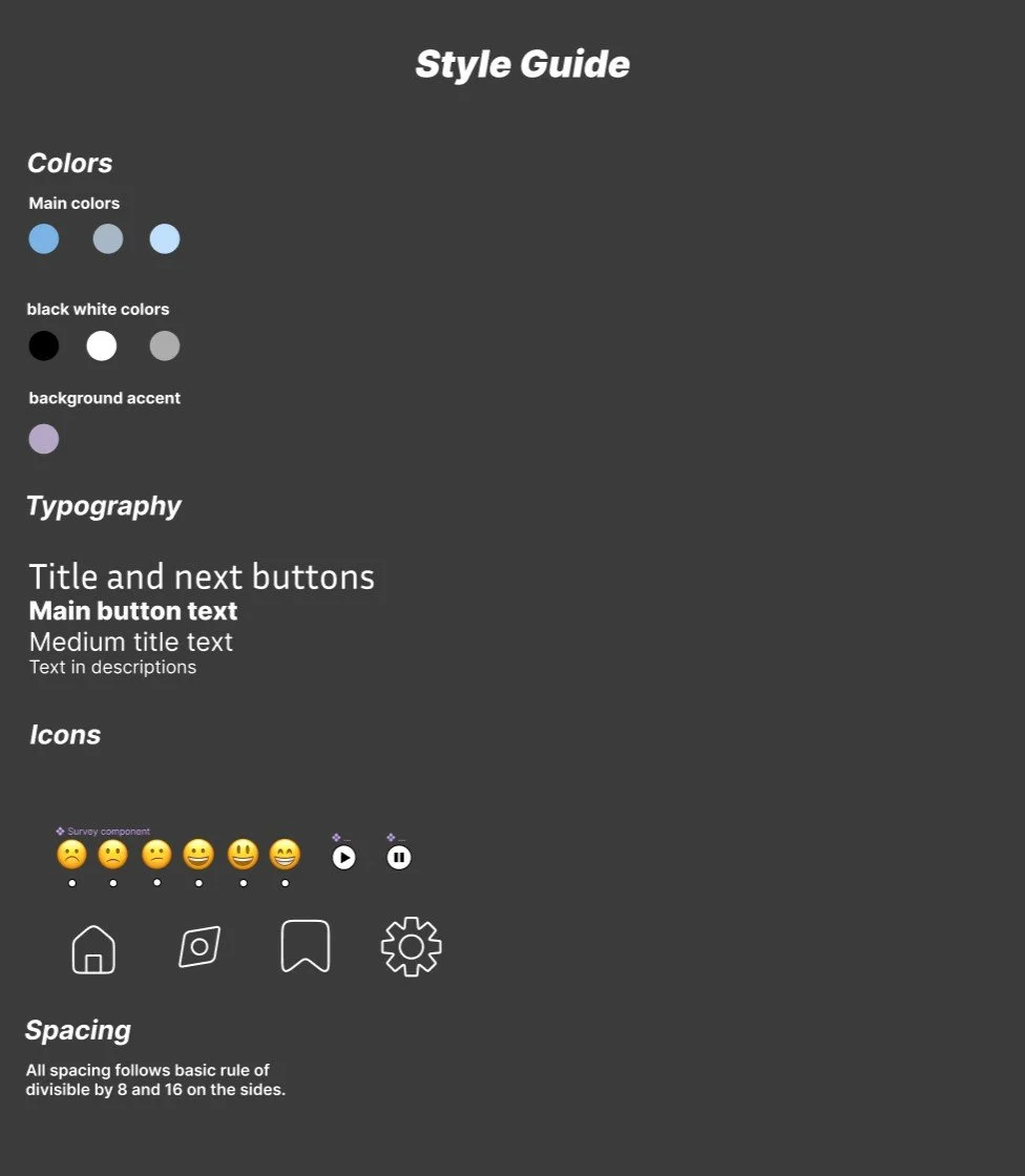
Milestone 2 was the completion of the style guide used on the user interface and all elements used in order to keep consistency. Such as the color, the logo and the text size. Milestone 2 was much more simple as it was mostly just the application of all the research and thought I put into the idea onto an actual wireframe. The colors I chose were in line with the feelings of tranquility which I personally associate with the color blue. The logo I wanted to keep simple as it could signify to the user this application is for your relaxation and not to be overwhelmed.
Below is the layout of the prototype. The overall design in Milestone 2 was completed and most of the prototyping complete. All that was left was touchups for the completion of the project.
Milestone 3
The final refinement of the app. Below I have left an embedded link to the Figma prototype of my UI design of the Moment application:
Conclusion
Overall I felt satisfied on the outcome of this project and learned many ways and approaches of creating a UI design as it is much more in depth than I had originally anticipated. I would have liked to have put more effort into the project but due to the time constraint it that was the unfortunate case. Thank you for reading this far and hope you enjoyed the Moment!


